May 18, 2023
A Glitch in The Percentile
One of many benefits of working with data is its prospect for reliable information and robust judgements. However, an opportunity of being subtlety misguided by its potential is not a joke at all. Grounding conclusions on data demands awareness.
This time, I'm writing a story about my experience in observing latency and performance of two gateway load balancers. It was part of a cloud migration project, we needed to pick up a load balancer for our api gateway in a new environment.
Optimistic ideal aims were set in place, like any engineering project wants to conceive in every corner of the world, we needed a fast and reliable one.
We started out from the first aim which was to catch the fast one by measuring latency, getting gateways performance profiles, and bringing the numbers side by side.
There were two gateways we examined, argo-a and tunnel-b. It would’ve been fun too if I could present them as ng-a and inx-b. To avoid this writing from a commercial use, let’s go with gateway-a and gateway-b.
We went to our stable tacking our horse with a saddle and stirrups. We got our gateway-a and the gateway-b required components assembled to expose our api gateway deployed in kubernetes. There we were set for the barrel race.
Load testing is dead simple nowadays. We crashed our gateways with an open source tool named vegeta. The best thing is that not only it provides a brief summary of what the latency is looking like, it also accommodates us with raw load test result data in case we want to process the data further with our own tool.
This weapon allowed me to pull latency data and compose a report for my team in a day.
As blind as it could be, coming from the campaign of getting the fastest one, when l looked at this table, my pupils irresistibly went straight to the min values.
Shifting my sighting to the p50, and p90 values, the difference looked so trivial. Hundreds of milliseconds won’t put a dent in the scale we had. I tripped over the p99 and the max values, the p99 values were still under milliseconds, they didn’t seem alarming.
However this gateway-b max value was looking a bit pathetic, it was 14 seconds. This looked so terrible for latency, but this is a maximum value, this should be an edging case. There would be one to five times out of thousands occurrence. Production should tolerate and relax with it.
I came to draw a premature conclusion affirming that the gateway-b wins over the gateway-a. With a smile on my face, I locked my screen and slammed it as if I earned a victory, feeling relieved knowing that this work took faster than I had thought of.
By the next day, the 14 seconds thought sneaked back into my mind. It was this voice. “Is it really? Is this really what’s happening? How can this look so easy? How can this feel so wrong?” These questions ran over my head again and again like a creeping Kubernetes CrashLoopBackOff. What the actual duck!
It felt like I was cornered in an empty room. It kept tailing me when I took a shower, when I went for a walk, when I went to a grocery store, at a parking lot, at a national public library, it was all over the place. I couldn’t stop thinking about it.
The force of curiosity pulled me back to my atelier. This time, I wanted to get dirty with the raw data. I had a hunch that there was something lurking behind this appalling number. I needed to find out.
I googled what’s the fanciest jupyter lab way of charting this data, also one attempt to catch up with the latest hot stuff out there. I didn’t expect to arrive at seaborn documentation. I read over several pages, I instantaneously recognized greatness by just looking at what I needed to visualize my data.
After hours of scrolling up and down, left and right, saturated with fascination disguised procrastination, I landed on the sns catplot plot, which I found very neat and handy, easy to use.
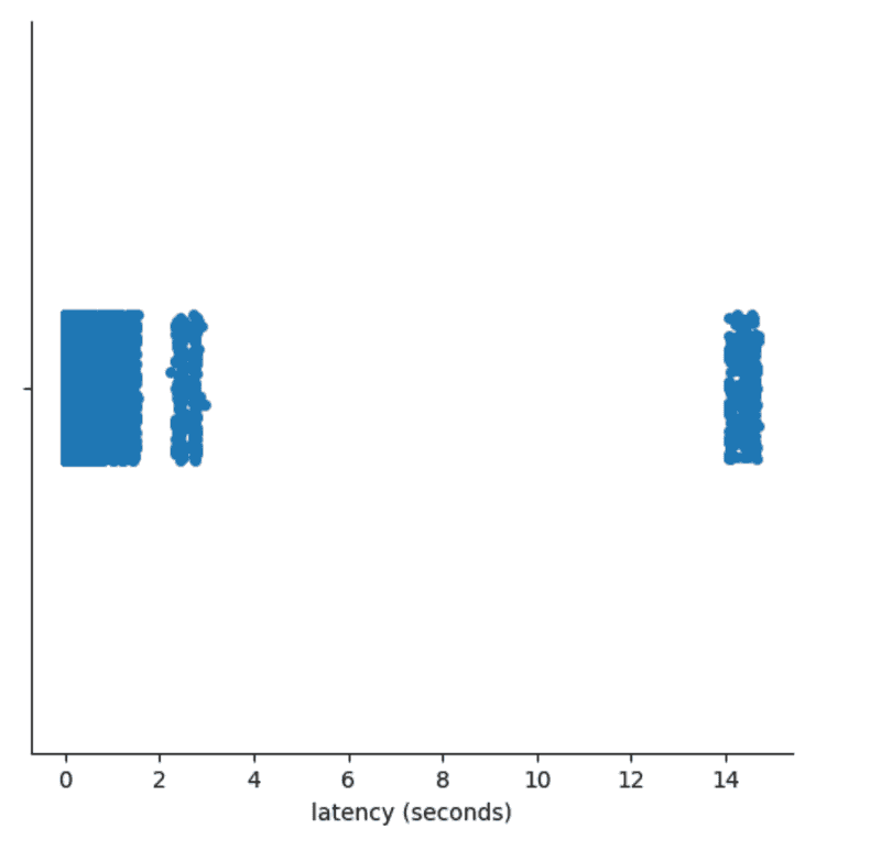
I managed to get this raw pure rich enzyme visualization in a couple lines.
For me, this was jaw dropping. This was shocking, the freakin 14s might be like the tip of the iceberg. There were some requests responded above a stretch of my acceptable threshold.
I went from being steadily tenacious to bewilderingly suspicious. This particular finding dispatched a jarring petrifying shameful introspect to me. What does the statistics percentile actually mean?
I couldn’t believe it would call me to triage my statistics elementary understanding injury. I went to Wikipedia and I got this fancy percentile definition.
In statistics, a k-th percentile, also known as percentile score or centile, is a score below which a given percentage k of scores in its frequency distribution falls ("exclusive" definition) or a score at or below which a given percentage falls ("inclusive" definition).
These words looked like an abstract class with a too broad implementation for me. Suffice to know that I won’t be able to instantiate it, I need to extend and make it meaningful in order to rake its fungible properties in.
How can I map this wikipedia percentile definition to my current circumstance? What does it mean to my data?
Believing like I knew how to do it, I went to assess my thoughts by doing a basic behavioral observation with a brute variable testing. The idea was what if I sampled my data with rudimentary numbers in the shape of my real data in order to excavate the ground.
I went lining up an array of numbers and trying to discern what the p25 and p90 produce. Here’s to demonstrate the percentile calculations.
np.percentile([1,1,2,10], 25)

# 1.0

np.percentile([1,1,2,10], 90)

# 7.600000000000001
Given that they result in these numbers, I set out some low numbers to theme them up with my load test data pattern, and it painted its real colors.
np.percentile([1,1,1,1,1,1,1,1,1,1,2,10], 25)

# 1.0

np.percentile([1,1,1,1,1,1,1,1,1,1,2,10], 90)

# 1.9000000000000004
This conveyed my mind that If I saw dominating values in low percentiles, and there was a population disparity between low and high percentiles, I would see the values of high percentiles approaching low percentiles.
Translating that to my case, If my load test data was populated with plenty of low latency results which gave me a low number of p25 per say, it shouldn’t be shocking if the p99 would come near to that low number.
Consequently, the given sheer amount of low latencies blitzed the p90 and p99 gateway-b latency in a tumbling sense.
It got me thinking, if this was true, would this behave consistently? Was this just a prick of defiance? Would I find it if I do it repeatedly?
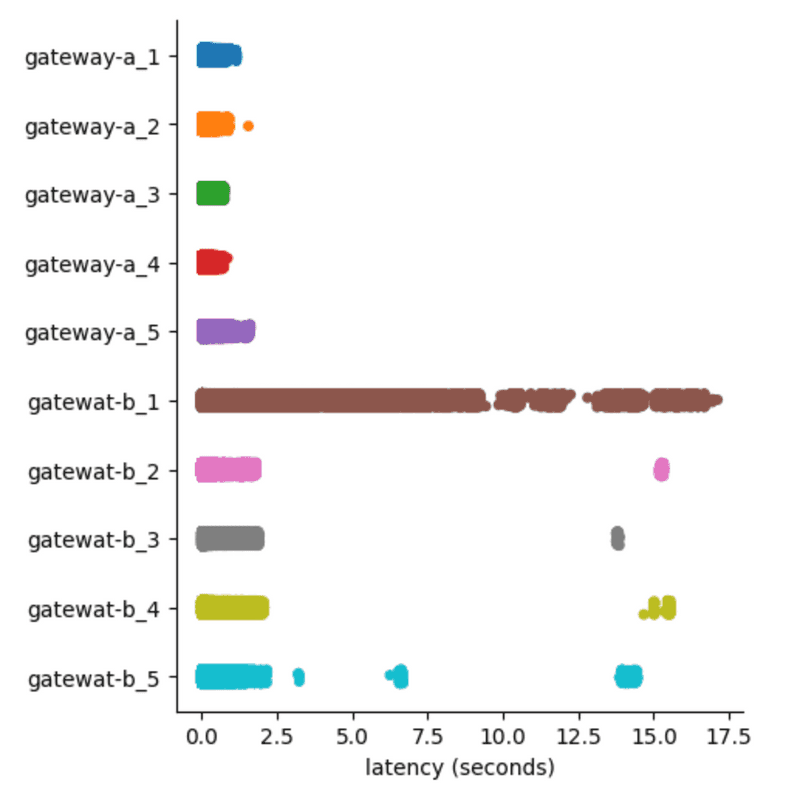
I went performing 5 tests iterations for both gateways harvesting more data in light of purging my assumptions.
It was alleviating though unfortunate to see this concerning pattern reemerged in other gateway-b test iterations. This was invisible until I pulled the sns cat plot.
It was kind of working backward, where a visualization quickly helped me out see what was happening in my data, then it lured me into the bottom with statistical percentile observation.
I was really hoping that my hunch was wrong because I had a bias toward gateway-a in the beginning of the work. It would be diabetically sugary sweet if the result aligned with my presupposed idea.
I went on my hunt carefully. I deliberately allocated breaks just because I didn’t want to get caught in a train of one sided dubious complacent thoughts. What a very dangerous path to be on.


